
Home Improvement Color Matching Guide: How Natural Light Shapes Interior Color Choices
When it comes to home decor, color isn’t just about personal taste—it’s a dynamic element that shifts and evolves with the light streaming through your windows. In this guide, we’ll break down the science of warm vs. cool tones, how light direction and time of day alter color perception, and practical tips to choose hues that work with (not against) your home’s unique lighting.
First: The Basics—Warm, Cool, and Neutral Tone
Before diving into light, let’s refresh our understanding of color families—they’re the building blocks of any successful decor scheme.
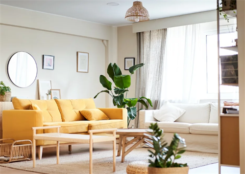
1. Warm Tones: Think reds, oranges, yellows, and soft terracottas. These colors radiate warmth and vibrancy, reminiscent of golden sunshine on a summer day.Visually, they “advance”—meaning they appear closer to the eye, which can make small spaces feel cozier (but be careful: too much warm color in a tiny, bright room can feel cramped).
2. Cool Tones: Blues, greens, grays, and soft purples fall here. They bring a sense of tranquility, much like standing in a peaceful woodland or gazing at an open, cloudless sky. Unlike warm tones, cool hues “recede”—they look farther away, making narrow hallways or low-ceilinged rooms feel more spacious.
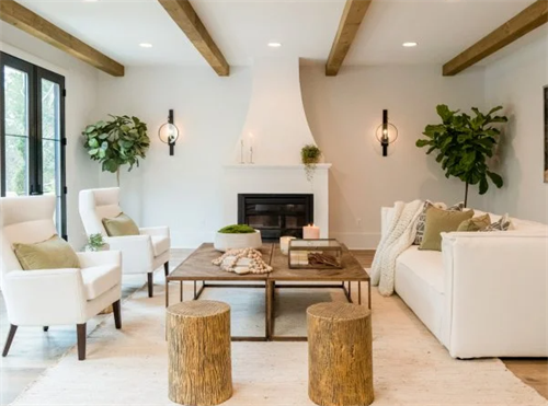
Neutrals—such as whites, beiges, taupes, and charcoal grays—serve as the quiet backbone of interior design.On their own, they don’t tilt warm or cool (though many whites carry faint undertones—more on that soon!) and they help ground stronger colors, preventing a space from becoming overpowering.
Beyond Temperature: How Tones Affect Perception?
Color does more than set a “mood”—it tricks our brains into perceiving space and time differently. These subtle effects are key to designing functional rooms.
1. Space Perception: Using Colors to Expand (or Cozy Up) a Room
The “advancing” and “receding” effects of warm and cool tones are game-changers for small or awkwardly shaped spaces. For example:
If your hallway feels short and closed-in, paint the far wall a soft cool blue or sage green. The cool tone will visually push that wall back, creating the illusion of more depth. Add a small mirror on that wall to amplify the effect—light will bounce off it, making the space feel even larger.
Conversely, if your living room is cavernous and lacks warmth, use warm tones strategically. A terracotta accent wall behind the sofa, paired with mustard yellow throw pillows, will “pull” that area forward, making the room feel more intimate for movie nights or gatherings.
2. Time Perception: Colors That Speed Up (or Slow Down) Your Day
Have you ever realized how quickly time seems to pass when you’re in a brightly decorated, red-toned fast-food place?That’s no accident—warm tones stimulate our brains, making us feel more energized and less aware of time passing. Cool tones do the opposite: they calm our nervous systems, making moments feel more relaxed and unhurried.
Use this to your advantage at home:
-High-traffic spaces: If you want to encourage quick, efficient movement (like a mudroom or a home office where you need to stay productive), warm accents (think a burnt orange doorknob or a yellow desk lamp) can help keep energy levels up.
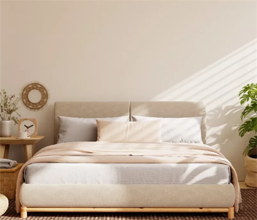
-Relaxation zones: Bedrooms, bathrooms, or reading nooks benefit from cool tones. A soft sky-blue bedroom wall, for instance, can make your evening wind-down feel slower and more peaceful—perfect for getting better sleep.
The Star Player: How Natural Light Alters Color
Here’s what really matters: the exact same paint color can appear entirely different in the morning compared to the evening, or in a room that faces south versus one that faces north.To understand why, let’s break down how sunlight changes throughout the day—and how that affects your walls.
1. The Science of Sunlight: Why Color Shifts
Sunlight isn’t “white”—its hue changes based on the sun’s position:
From morning through midday, the sun sits higher in the sky, and shorter blue wavelengths become more prominent.This makes sunlight feel bright and “cool,” so warm tones (like a soft yellow) will look crisp and lively, while cool tones (like a pale blue) will feel fresh, not icy.
Evening (Sunset): As the sun dips low, long-wavelength red and orange light take over. This warm, golden glow softens cool tones—think how a gray wall can look faintly lavender at dusk—and makes warm tones feel richer (a terracotta wall might deepen to a cozy brick red).
2. Room Orientation: The Biggest Factor in Light Quality
Your room’s direction (which way its windows face) determines how much light it gets and what kind of light. This is non-negotiable when choosing colors—ignore it, and you might end up with a bedroom that feels like a cave or a kitchen that’s too harsh.
Let’s break down each orientation and the best colors for it:

A Common Mistake: Copying Photos Without Checking Light
You’ve probably seen stunning photos online—say, a child’s bedroom with soft blue walls that look bright and cheerful. But here’s the catch: many of those photos are taken in homes with south-facing windows (abundant direct light), often in countries like the US where homes are designed for maximum sunlight.
If you live in a small apartment with a north-facing secondary bedroom (common in many cities!), painting those walls the same blue will backfire. Without direct sun, the blue will lose its warmth and feel cold—hardly a cozy space for a kid to play or sleep. Instead, opt for a warm off-white or soft yellow—colors that will glow even in indirect light.
The “Psychological Temperature” Trick: Save on Energy (and Comfort)
Colors don’t just look warm or cool—they make us feel that way, too. Studies show the psychological difference between warm and cool tones can be as much as 3°C (5°F). That’s a small but noticeable shift that can make your home more comfortable and cut down on heating/cooling costs.
1. Hot Climates/Summer: Use cool tones to create a “natural air conditioner.” Swap heavy red curtains for light blue ones, paint your living room walls a soft sage green, or add gray throw blankets. These hues will make the space feel cooler, even on sweltering days.
2. Cold Climates/Winter: Warm tones are your friend. Paint your bedroom a soft peach, add terracotta floor rugs, or hang orange artwork. These colors will make the room feel cozier, so you might not need to crank up the heat as much.
Practical Tips for Choosing Colors That Work With Your Light:
1. Test Colors at Different Times of Day
Don’t commit to a full gallon of paint just from a swatch. A better approach is to:
Buy sample pots of 2-3 colors you like.
Paint large swatches (at least 8x10 inches) on poster board or directly on your wall (in a corner where light changes).
Check the swatches at 9 AM (morning light), 2 PM (afternoon light), and 7 PM (evening light). You’ll be surprised how much they shift!
For example: A “warm white” swatch might look creamy in morning sun but slightly yellow at dusk. A “light blue” might look bright at noon but pale gray by evening.
2. Understand Undertones (Especially for Whites)
White isn’t just white—most have subtle undertones (warm: yellow, pink; cool: blue, gray). This is make-or-break for north-facing rooms:
In north-facing rooms, go with whites that have warm undertones (such as “ivory” or “cream”) to balance the cooler light. A “cool white” in this setting can come across as too sharp.
South-facing rooms: Cool whites ( “pure white,” “bright white”) work best—they’ll stay crisp, not yellow, in direct sun.
3. Use Neutrals as a Base
If you’re unsure, start with neutrals. They’re flexible and work with any light:
Beige: A warm beige is perfect for north-facing rooms (adds coziness) or east-facing rooms (balances morning sun).
Gray: A soft warm gray (with hints of brown) works in west-facing rooms (tones down afternoon heat), while a cool gray shines in south-facing spaces.
White: As above—match the undertone to your light.
4. Accent Colors: Add Pop Without Overwhelm
If you’re drawn to bold colors but hesitant to cover an entire wall, incorporate them as accent touches:
North-facing room: Add a blue throw pillow or green plant (cool accents, but small enough not to feel gloomy).
South-facing room: Hang a red piece of art or add orange candles (warm accents that won’t feel too bright).
Final Example: A Male’s Bedroom in Blue (How to Make It Feel Lively, Not Cold)
Let’s put this all together with a common question: “I’m a guy, and I want to paint my bedroom blue—gemstone blue or sky blue? How do I make it feel lively?”
First, check your room’s orientation:
-If it’s south-facing (bright sun): Gemstone blue (a deeper, richer cool tone) could work—direct sun will keep it from feeling dark. Pair it with warm accents: a beige comforter, wooden nightstands, and a yellow desk lamp (warm tones to balance the cool blue).
-If it’s north-facing (soft, cool light): Skip gemstone blue—it will look too dark. Go for sky blue (a pale, soft cool tone) instead. Add even more warmth: a terracotta rug, orange throw pillows, and warm white curtains (to filter the cool light).
Either way, avoid all-blue everything. Mix in neutrals (beige, warm white) and warm accents to keep the space from feeling sterile. Add texture, too— a knit blanket, a woven basket—to make it feel cozy and lively.
Color is a powerful tool, but it only works when you pair it with your home’s natural light. By understanding warm vs. cool tones, how light shifts throughout the day, and your room’s orientation, you can create spaces that feel not just beautiful, but functional—spaces that adapt to your routine and make every day feel more comfortable.
RELATED GUIDES
Is Your Sofa Toxic? Understanding Flame Retardants and How to Avoid Them
You’ve probably spent more time on your sofa over the past few years than ever before. It’s been your office, your movie theater, your weekend nap zone, and the spot where you unwind after a long day.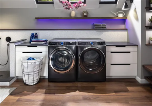
Are Smart Washers and Dryers Worth Buying?
In today's world, where technology has become an integral part of every aspect of our daily lives, from smartphones to smart homes, even the laundry room has embraced innovation.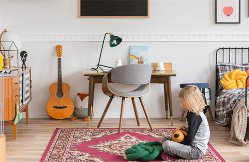
Children's Room Furniture Guide: Adjustable Design Plans for Growth
If you're a parent, you've probably stood in the middle of a children's furniture store and felt completely overwhelmed.
A Guide to Washing Machine and Dryer Upkeep
As early autumn’s chill sets in, line-drying clothes becomes a hassle—making washers and dryers essential for modern households.